
Aligning an iconic retailer to today's digital age
As digitisation sweeps across the retail industry, today’s Australian consumers expect a user-friendly shopping experience both in-store and online. According to Klarna (2021), 61% Australians were shopping more on their mobile device than they had 2 years ago.
As a major player in the industry, Kmart, found itself falling behind due to the absence of a shopping mobile app, depriving customers of a seamless and convenient shopping experience.


PROBLEM
Digitising the shopping experience with a hybrid app
The aim was to create a shopping mobile app that offers a hybrid web and native experience to users. To accomodate for this given scope the particular design question that framed up our discovery process was:
…how might we construct a seamless shopping experience as users navigate through web and native features?
Secure
Customers need to have transparency and control over how their personal data is being used to improve their shopping experience.
Reliable
It is important for customers that the app functions and features operates as they are supposed to. The ability to search, browse and buy products is most important.
Efficient
Customers are interested in saving time and effort with the barcode scanner as a way to bookmark items that they can refer to at a later point.
DEFINING MVP SCOPE
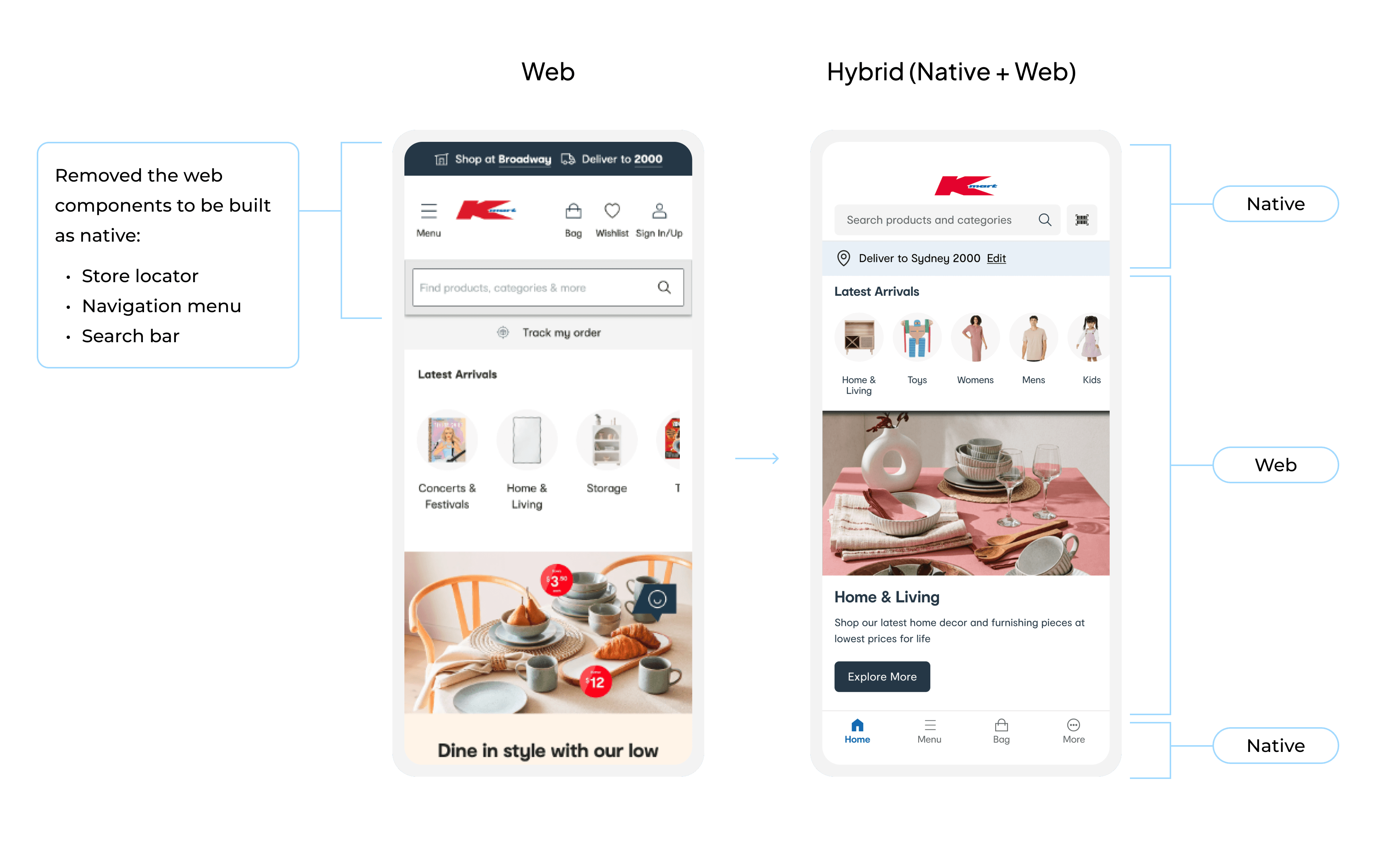
Alignment with stakeholders to build as native or web
Native apps generally offer smoother performance and faster response times, but building and maintaining it can be timely and costly. Our goal was to work with stakeholders to determine which features should be developed as native or web-based for the MVP. In order to decide this we evaluated the desirability, viability and feasibility of features to be built as native or web.
I facilitated a workshop with the product owner and principle mobile engineer. Key questions that guided the workshop were:
How valuable is the functionality or feature to the user?
What is the industry standard and our competitors' approach to building those features as native or web?
How much effort and time it is to build and maintain as native or web?
Some of the features we decided to build natively are the onboarding, search, barcode scanner and categories. The high level reasoning is outlined in the table below.

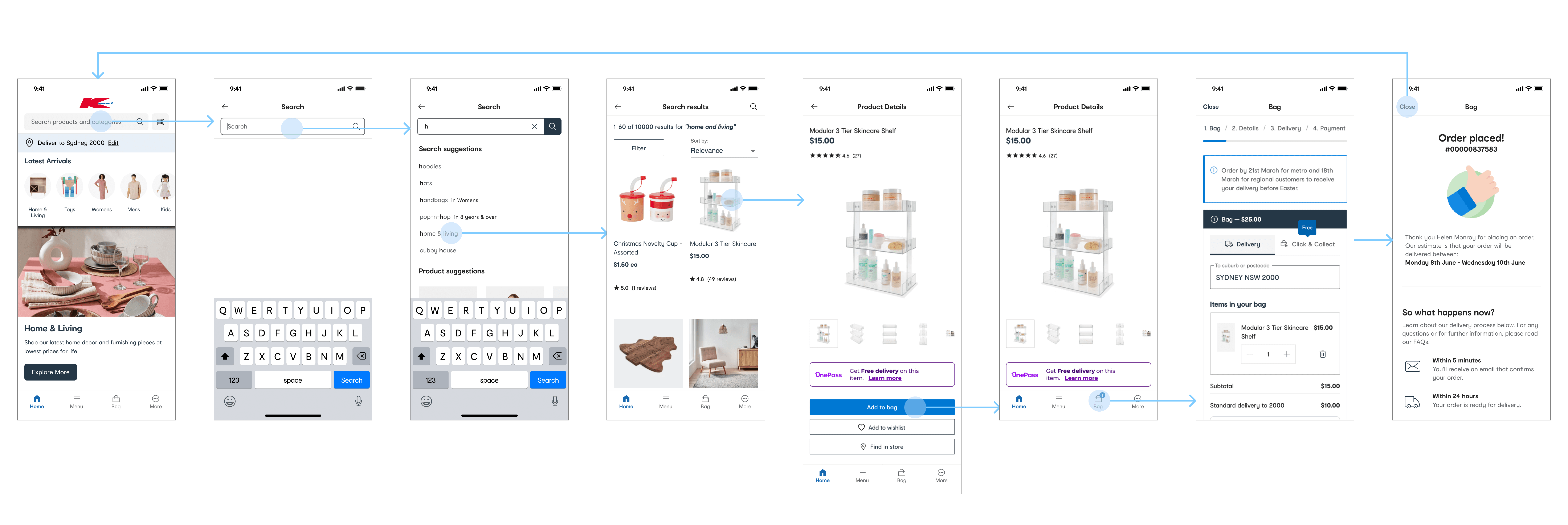
USER FLOW
A user pathway that emulates a native app-like experience from the search to purchase of a product
We designed user flows to help us identify the screens and components required for the MVP prototype. Below is one of the user flows we designed of the shopping experience from the search to purchase stage.

APPROACH
Integrating the web into the native mobile experience
When designing the prototype of a hybrid native and web app, a key part throughout our process was aligning modern web principles with that of the native mobile experience.
In order to integrate the web wrapped content seamlessly, we conducted a comprehensive evaluation of the site content and information architecture to identify existing web components, including hyperlinks, breadcrumbs, and header/footer elements. Select components were removed from the web page based on their impact on the user experience, mitigating any potential friction.
PROTOTYPING & TESTING
Iterative prototyping & testing
We conducted further testing of the high fidelity designs which guided the iterations and informed us on the future roadmap. This was done via:
2x unmoderated testing rounds on UserTesting.com.
1x moderated testing session round with a customer research panel facilitated by Tgarage.
Ongoing iterations to ensure cross-platform usability (iOS & Android)
Since the MVP would be cross-platform, I also tested with Android users on the navigation to categories. Their choices between bottom and top navigation varied depending on the task which highlighted the importance of clear labels/icons. I tested multiple variations of icons and labels to represent the categories but this ultimately show mixed and inconclusive results.
As early adopters would most likely be existing Kmart mobile web users and the majority being iOS users, we opted for a familiar menu icon (common in Android/web) placed in the bottom navigation bar (option A).

A

B
Shaping the product roadmap based on user insights
Home screen

As the first page that users land on, the Home screen view (the area between the search bar and bottom nav) was used by users to find and explore products and categories.
Product Listing Page (PLP)

Users favoured infinite scrolling on the PLP which can be enabled if the page is rebuilt as native. This was a potential friction point that could impact conversion rates and the UX.

FINAL DESIGN
Helpful onboarding for a personalised shopping experience
The onboarding offers users a sense of transparency and control around notifications and location sharing. It was essential to articulate the benefits for the user to their shopping experience before requesting permission to change settings or access the data.

Search and buy across thousands of Kmart products
I designed a native interactive search experience that provides users with search and product suggestions and takes them through the integrated browsing and checkout web experience.
Scan a product anywhere including in more than 300 stores across Australia
The barcode scanner feature enables users to scan barcodes or shelf labels in store to price-check or find the relevant product information. It plays a crucial role in connecting the in-store experience with the online shopping experience.

Discover new products through categories
Users can navigate back and through through 2 to 4 levels of categories to find products.

OUTCOME
Enabled more customers to shop and save from mobile
100k+
App downloads across Android and iOS
2x

Conversion rate compared to mobile web
LEARNINGS
Love the problem, not the solution: I initially hoped that the design would be more native than web so that the team could create the best app-like shopping experience. However, as we considered the business needs it became clear that this would not be the case. So as I instead focussed more on the problem at hand of integrating web and native, I found myself less attached to the specific solution, and more eager to understand the world of web versus native which greatly informed the design.
Embracing failure as a learning opportunity: It was disappointing to see the negative customer feedback post launch that highlighted the shortcomings of the product as a hybrid app. But it was important to remember that the business now had their first mobile app released which, although not perfect, was sufficient enough for them to continuously iterate and improve on.
TESTIMONIAL
"Jenny has been with the Kmart mobile app team from the very beginning of the discovery phase of the project - it was her first project with Pretzel Lab after last years first Traineeship, and she has only had glowing reviews from key design and product stakeholders."
Oliver Heycoop
Product Owner